
The Rebrand Illusion: Vitale’s Versace
Pieter Mulier, the creative director of Versace, was recently appointed, and reignited my reflection on his predecessor’s short-lived tenure. Dario Vitale, the former creative director of Versace, had a highly publicized dismissal after he debuted just one seasonal collection that left the fashion world divided. Critics descended like sharks in a feeding frenzy as they accused him of a complete rebrand and disregard for the work of Gianni and Donatella Versace. However, a closer look at the house’s archives suggest that Vitale actually produced a collection sourcing the foundational designs of Versace. To understand how he honored the Versace heritage, one must look beyond the red carpet and return to the vaults.
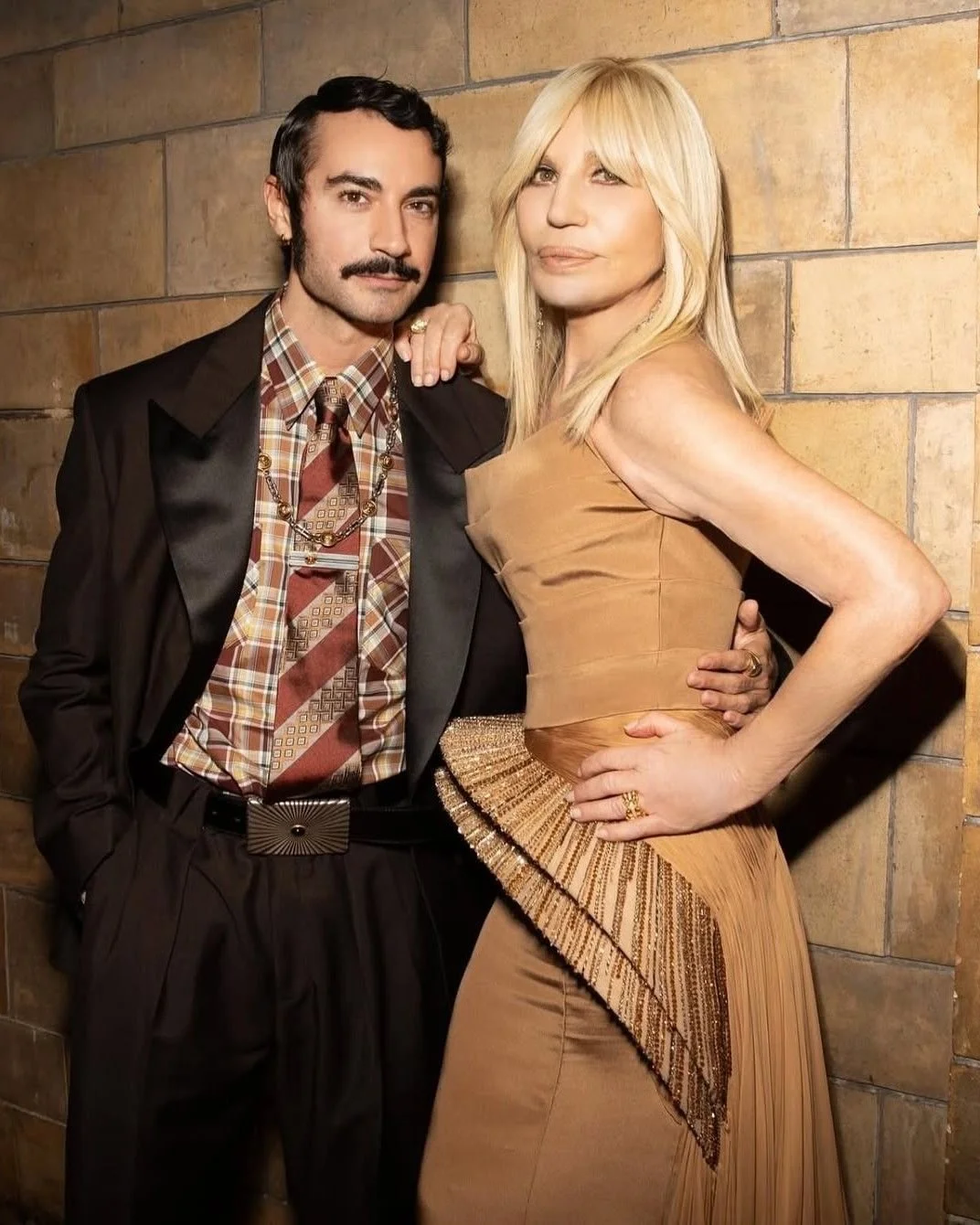
Photo/nss magazine
Who was Dario Vitale Before Versace?
Born and raised near Naples, Italy, Vitale gained his education at the Marangoni Fashion Institute in Milan. After graduation, he built his resume through the houses of Dsquared2 and Bottega Veneta. In 2010, he joined Prada Group, working under Miuccia Prada and Fabio Zambernardi, who were the design directors of both Prada and Miu Miu at the time. As Vitale ascended through the ranks of the fashion world, he eventually became the ready-to-wear design director for Miu Miu. After years of serving Miu Miu, Vitale left the fashion house to be the creative director for Versace, where he was then fired after one season.
Vitale’s nod to Archival Versace
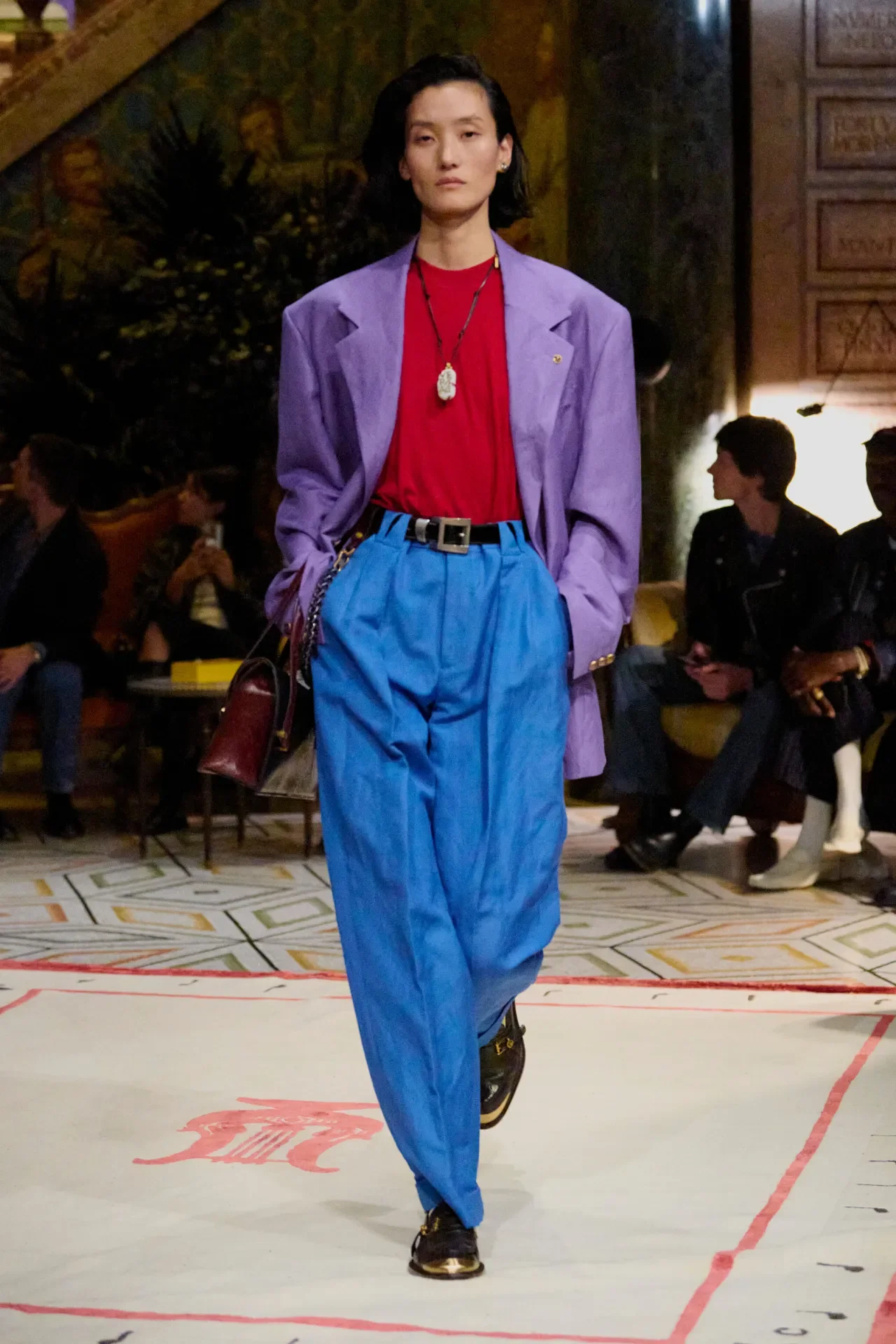
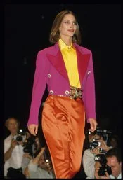
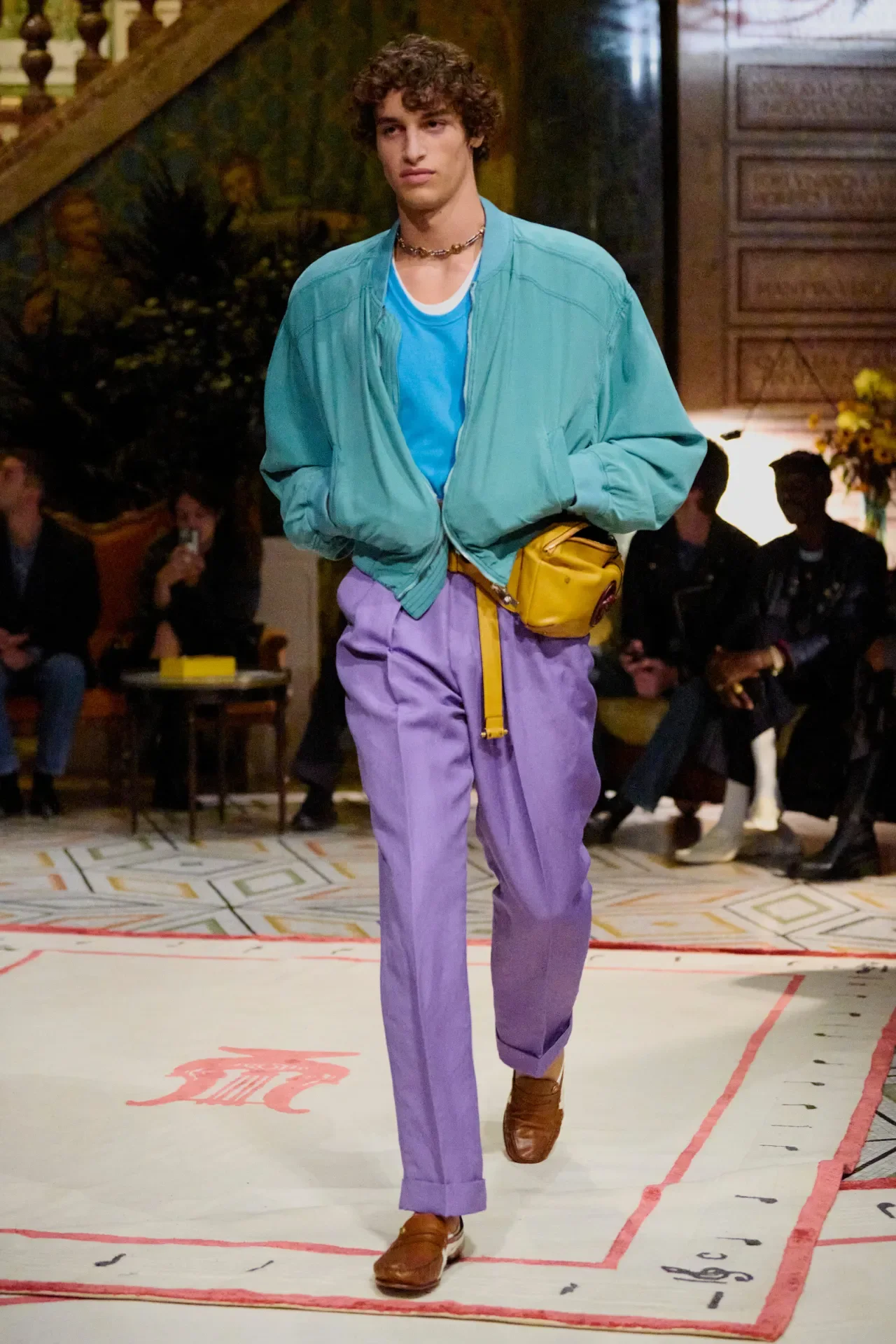
Critics called Vitale’s collection “too structured” as he debuted boxy silhouettes, sculptural shoulders and high-waisted pleated trousers. It seemed as if he had rejected the provocative and glamorous femininity Donatella Versace had solidified. Yet, when taking a retrospective look at the Fall/Winter 1989 and the Spring/Summer 1990 collections, we can see Vitale didn’t stray far from Gianni’s foundational concepts. These collections reveal Gianni’s emphasis on utilizing sharp, masculine lines and intricately tailored cutouts to accentuate body angles, a direct parallel to Vitale’s emphasis on form.
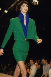
Photos/first VIEW/WWD/first VIEW
The simple, solid colors in Vitale’s collection were also dismissed as “lazy” compared to the Medusa symbol adorned with leather, jewels and gold hardware. However, despite this critique, these solid colors and bold lines are a recurring motif in the archives. The 1989 collection mirrors these concepts along with the Spring/Summer 2003 and the Fall/Winter 1991 shows. Vitale’s references to color schemes from Donatella’s 2003 show are vital to recognize, as the modern public primarily identifies the brand through Donatella’s vision. Although it may not be as eye-catching as the 2003 show’s emphasis on color, if one looks closely at each piece of Vitale’s collection, he references the color scheme, whether that be an inner-wear shirt, a skirt, socks or the whole outfit.
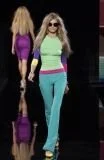
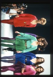
Photos/first VIEW/WWD/first VIEW
The appearance of pop art and hand-painted human faces on skirts and shirts in Vitale’s collection was also framed as his individual experimentation. However, it was actually a move that connected the brand back to its roots in fine art and celebrity worship. When one looks at the Fall/Winter 1991 and the Spring/Summer 1990 collections, high fashion is merged with modern art and iconography. Vitale’s decision to use portraits and layer diverse patterns was not a modern rebrand. It simply reflects Gianni’s decision to treat garments not just as clothing, but as a canvas for contemporary art and culture.
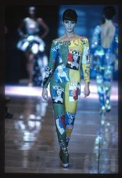
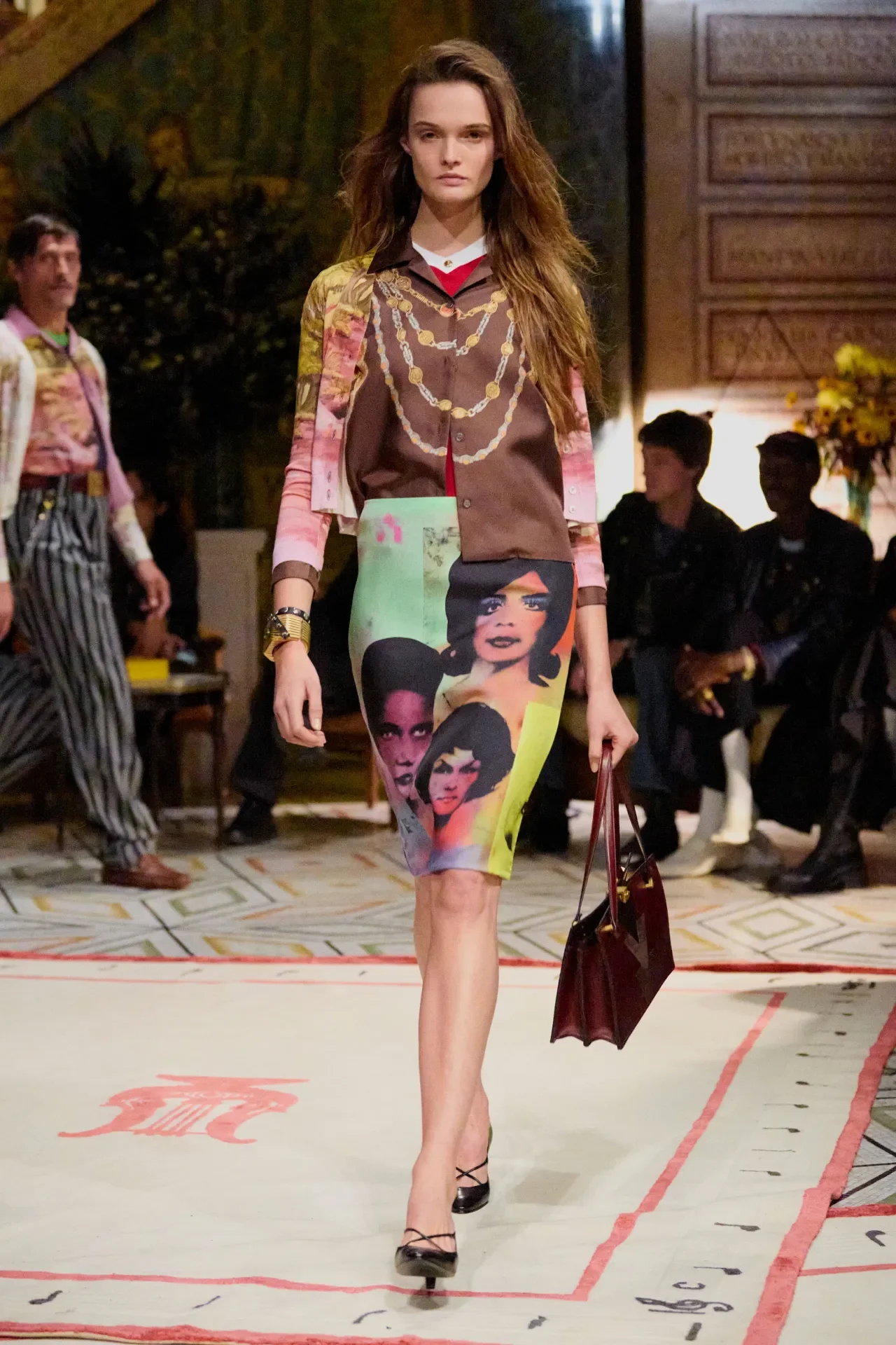
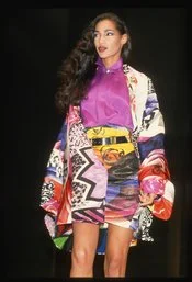
Photos/first VIEW/WWD/first VIEW
The collection’s trousers were also noted for their hypnotic and winding designs that were thought of as having no aesthetic correlation to Versace. Although, despite this, these swirling patterns were an intricately embroidered interpretation of the trousers shown in the Fall/Winter 1991 collection.
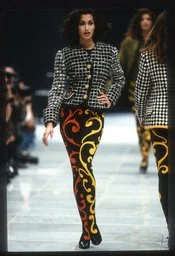
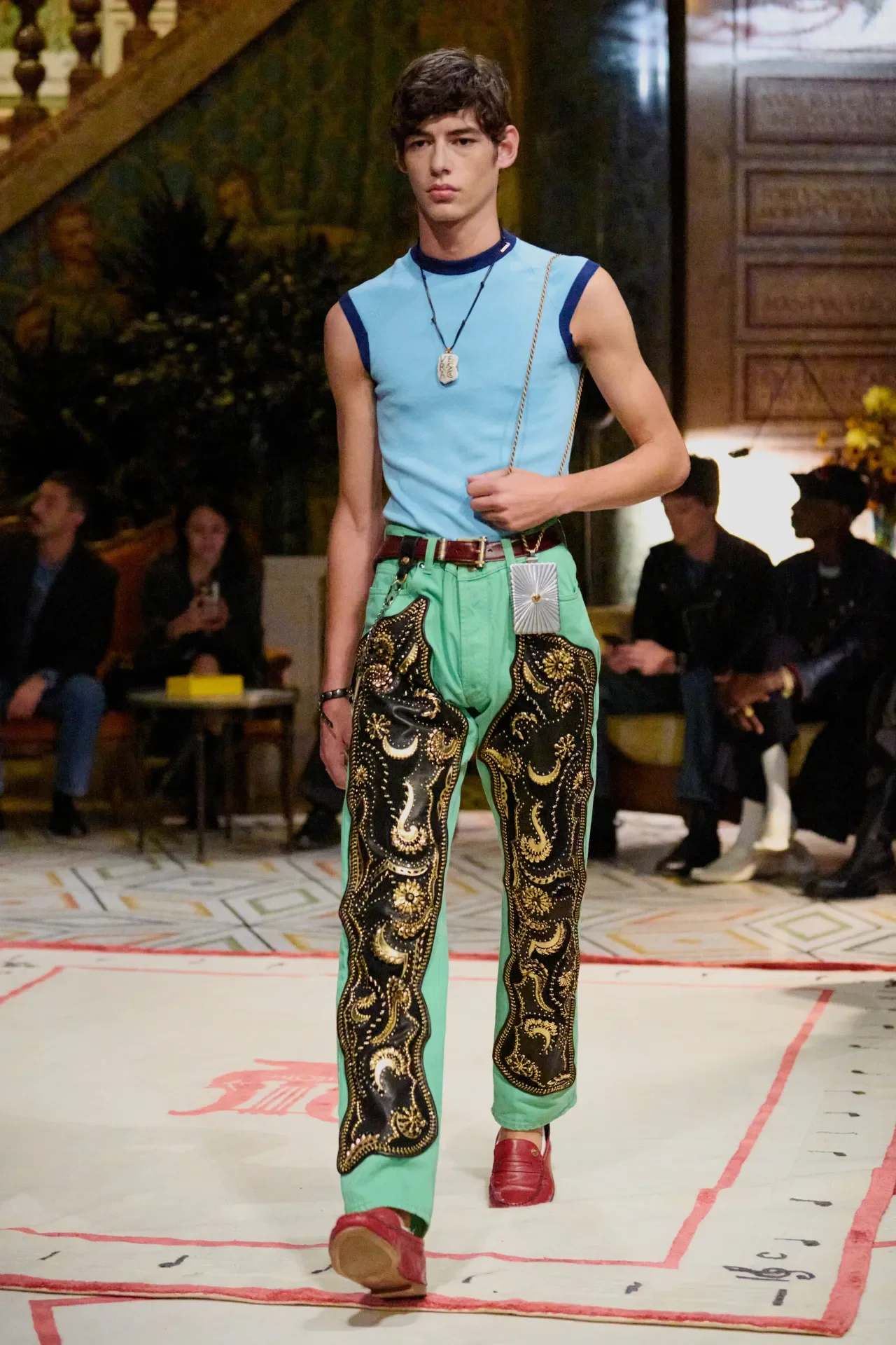
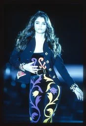
Photos/first VIEW/WWD/first VIEW
Finally, critics argued that the collection seemed “too casual,” and did not reflect the high-fashion opulence one would see celebrities sporting on the red carpet. Vitale had taken the creative liberty of giving the clothes a casual or “undone look” with cardigans and slouchy jackets, a choice that confused critics due to its seemingly random inclusion. However, this was not a random choice at all. The Spring/Summer 1989 and the Spring/Summer 1997 collections demonstrate that Versace always included looks with that casual feel of effortlessness. Leather jackets and blazers that mirrored office-wear slouched on models as they casually strolled down the runway in sunglasses. The attitude gave a sense of casualness but with hints of clean lines and expert tailoring, exuding quiet luxury, not the Met Gala. Gianni Versace sent out models with a simple, light cardigan over a glamorous dress or with a wrap-around blouse that could be tied around like a shawl. Vitale reciprocated this fashion choice with various models having a cardigan wrapped around their waist while wearing intricately embroidered dresses or pop-art shirts mentioned before.
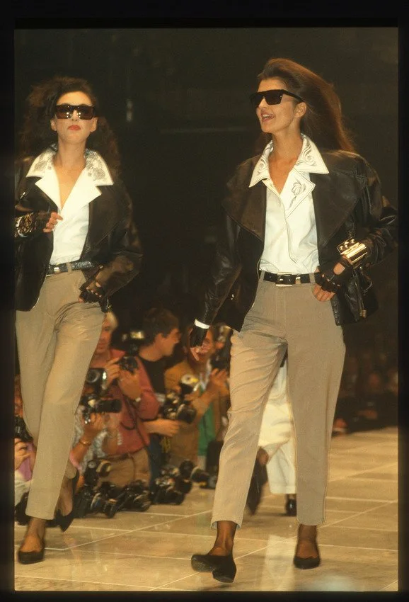
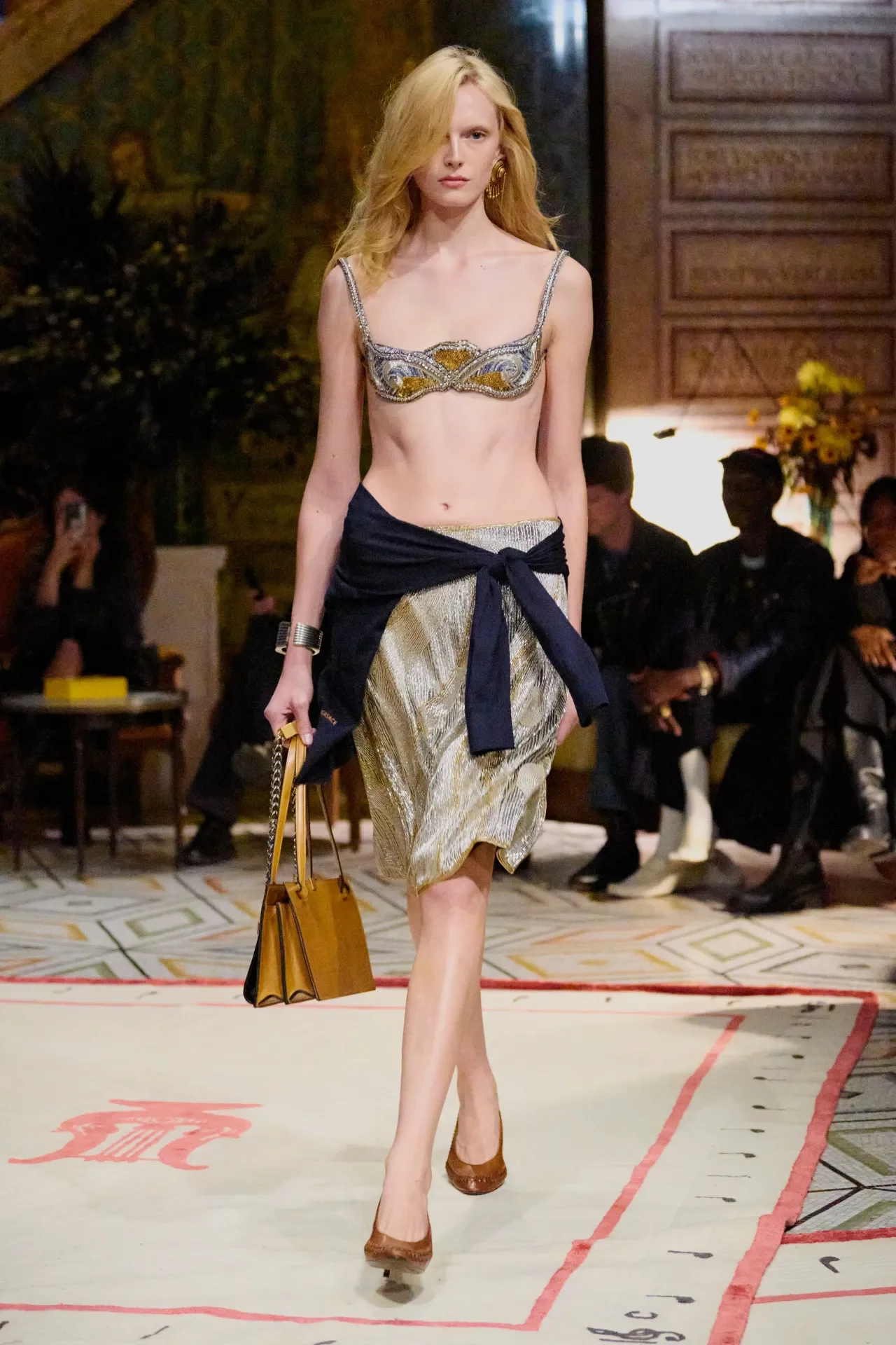
Photos/first VIEW/WWD/first VIEW
Goodbye Vitale
After weaving all these archival collections together, Vitale was not rebranding; he was curating Gianni’s original designs through a modern lens. He took the structure, iconography and experimentation found in the foundations of Versace and was sadly dismissed after trying to implement it in one season. Ironically, critics call this a “complete rebrand” as this collection has been argued as historically accurate for the brand. Vitale did not dismiss the glamour of Versace; he just revived the parts of Versace that most people had forgotten.
Editor: Sydney Annis
Graphic: Delaney Chernault